The identity
Struck, not printed.
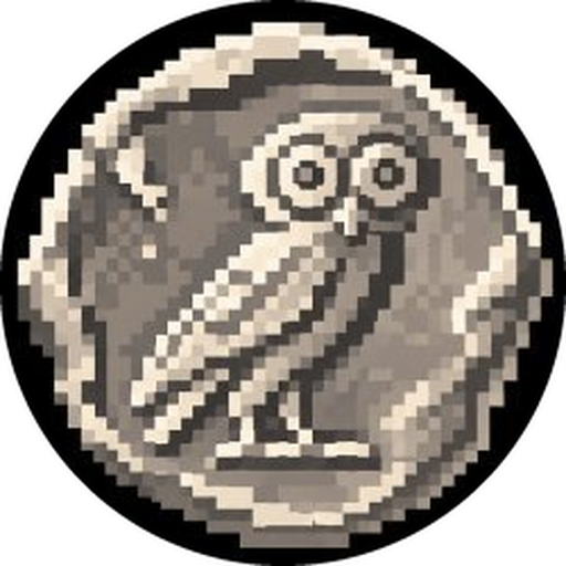
Everything here comes from one object: the owl of Athena as it was struck on the Athenian tetradrachm in the 5th century BC, redrawn pixel by pixel. The whole system is that coin, the black it sits on, and the one near-white light that falls across it.
Every colour below was measured off the artwork, quantised from the file itself rather than chosen alongside it. That is why they sit together: they already did.
I
The mark
The owl, in a struck disc. It is never redrawn, never recoloured, never set in a square. Pixels stay pixels: scale it by whole multiples and render it nearest-neighbour.

Do
- Keep clear space of one quarter of the disc on every side.
- Place it on black, or on bone at full contrast. Nothing in between.
- Let it be cropped by an edge if the layout wants it. Never by a shape.
Don't
- Smooth it. Bilinear scaling turns a struck coin into a smudge.
- Tint it, gradient it, outline it or add a glow behind it.
- Set the owl without its disc, or the disc without the owl.
II
The metals
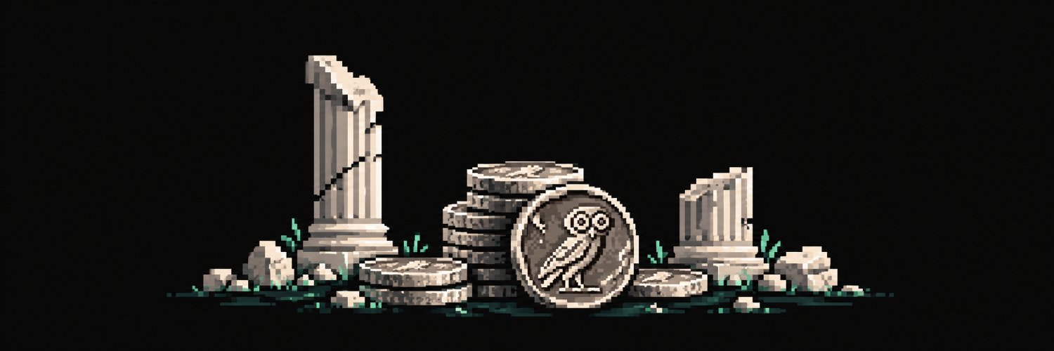
Quantised straight off the banner. Four greys of marble and one green. That is the whole palette, and it is why everything sits together: it already did. Black is not a background here, it is the majority of every composition: 83 % of the banner is #090909.
III
The letters
Display · Cinzel 700
Interface · Inter Tight 400/600
Figures · JetBrains Mono 400
IV
The voice
Plain, concrete, and short. The protocol is arithmetic, so the writing is arithmetic: say the thing, give the number, stop. No roadmap tense, no "we believe", no adjectives doing a verb's job.
Sounds like us
- "Hand in the coin, take the metal."
- "A weight you can dilute is not a weight."
- "Every coin melted makes the coins that stayed heavier."
Never
- Guaranteed, risk-free, safe, APY, passive income.
- A figure that no block can be pointed at. Empty reads as a dash.
- Exclamation marks, emoji in body copy, rockets of any kind.
V
Four pixels
The artwork is drawn on a grid about four screen pixels wide, in six tones. Anything that joins it has to be made of the same material, and that is a rule about rendering rather than a filter.
- Draw into a buffer a quarter of the size, then blow it up with no smoothing.
Antialiasing off;
image-rendering: pixelated; nearest-neighbour textures. - Flat shading, so every facet is one value and the light steps instead of sliding.
- Cut the finished picture to six tones, of the light, never of the channels. Quantising red, green and blue on their own turns warm stone into pink and mauve.
- Then read the colour off the ramp above: marble for everything, verdigris for whatever the scene drew green.
VI
The stage
The site's stage is the banner, in three dimensions: the same broken Doric columns, the same stack of struck coins, the same owl leaning against it, the same verdigris at the foot. It runs as a frieze along the bottom of the screen, and the app sits over it as a HUD: two pixel borders, corner ticks, a pixel typeface for anything that is a label, and figures in mono so they line up between reads.
And it is the mechanism, not scenery. The coin is the coin. The stack is the reserve and its height is the number. One rule behind it is the weight, the other is where the market stands; when the market drops under the weight, the first turns verdigris. Striking sends coins across the frame and into the stack, where they stop existing.